

The right typeface can make a design feel intentional, modern, and worth paying attention to. The wrong one makes everything look like it was assembled from a default list.
These are all popular fonts. You've probably seen every one of them on a dozen sites this week. But that's sort of the point. They're popular because they work, and knowing why each one works makes a real difference when you're picking fonts for your own project.
I've used all of these across my own templates and client work. Here's what I've learned about when to reach for each one.
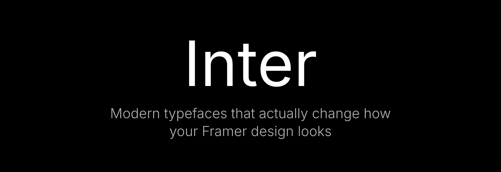
1. Inter
Inter was designed for screens, and you can feel it. The letterforms are open and balanced, easy to read at any size without ever feeling clinical. I use it in my own template Das Studio because it does something rare: it disappears. You don't notice Inter. You just read.
That's what makes it one of the best defaults in Framer. When you're unsure, Inter is the choice that never costs you anything.
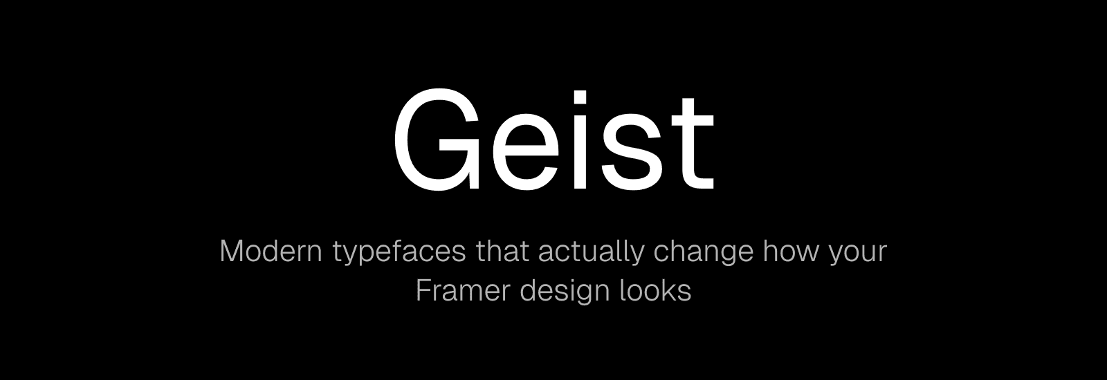
2. Geist
Vercel made this for their own ecosystem, and it carries that same precision. Geometric but not stiff. The numbers are especially good. There's a technical quality to them that makes dashboards and data-heavy layouts feel sharper.
You're actually reading Geist right now. This site uses it, and so does my template Squish. Once you start noticing it, you see it everywhere.
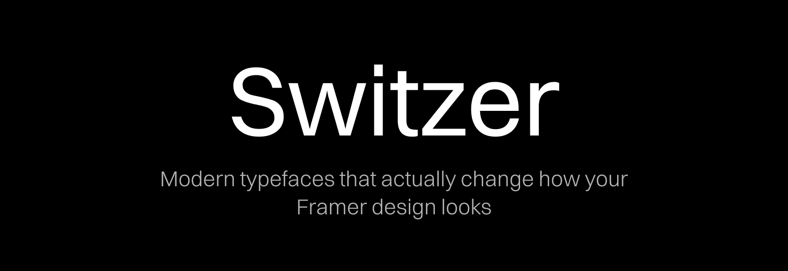
3. Switzer
Switzer feels familiar the first time you use it. Clean, balanced, with just enough personality to not be boring. The weight range is solid, so it works for both body text and headlines.
Pairs well with Geist or Inter. Switzer up top, either of those underneath, and the whole thing feels polished.
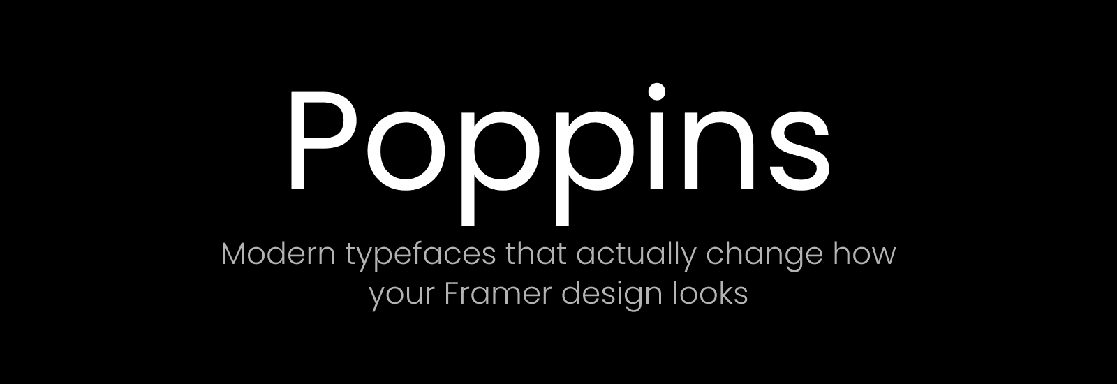
4. Poppins
Rounded terminals, geometric skeleton. Poppins reads as modern and warm at the same time, which is harder to pull off than it sounds. It works across platforms too, so if you're building something that lives in more than one place, it holds up.
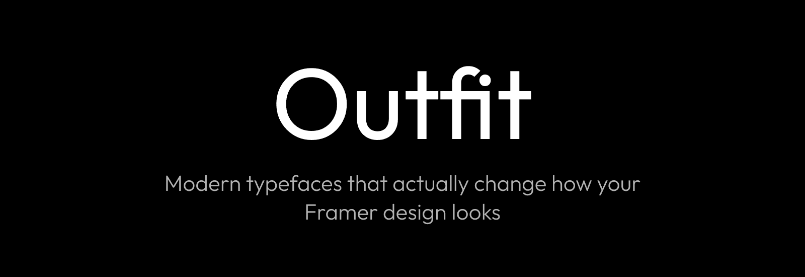
5. Outfit
Outfit sits in an interesting space. Geometric and clean, but with just enough warmth to avoid feeling corporate. The proportions are generous, which means it looks especially good at larger sizes. Headlines, hero sections, big type on a landing page. That's where Outfit does its best work.
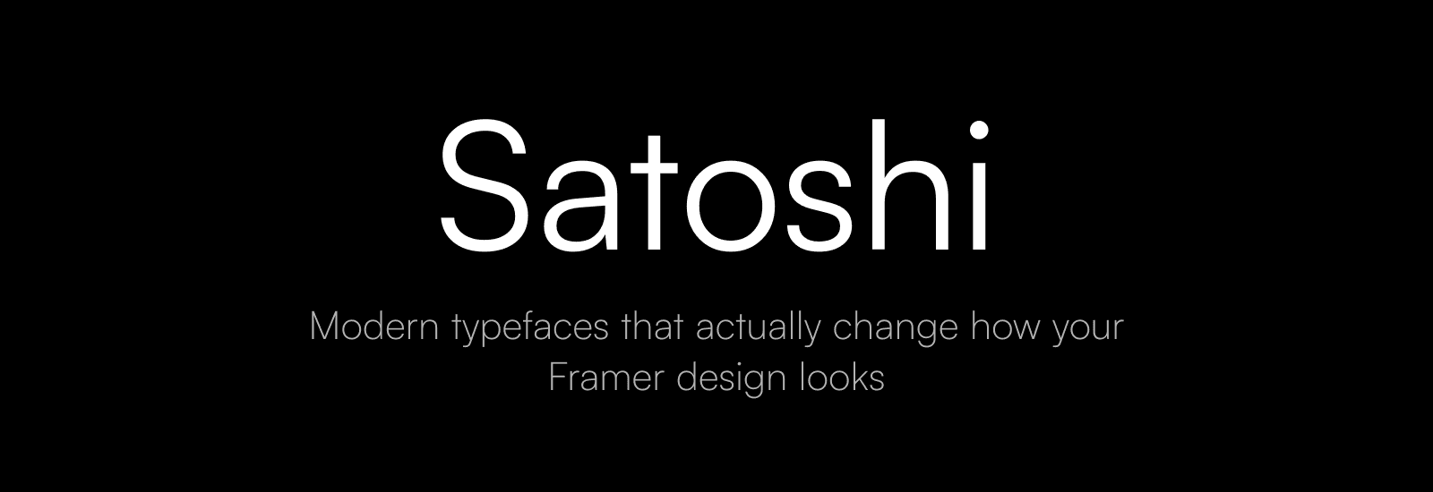
6. Satoshi
Tight spacing. Geometric forms. A subtle sense of intention in every character. Satoshi was designed for contemporary web work, and it shows. There's a premium feel to it that suits tech products and startups well.
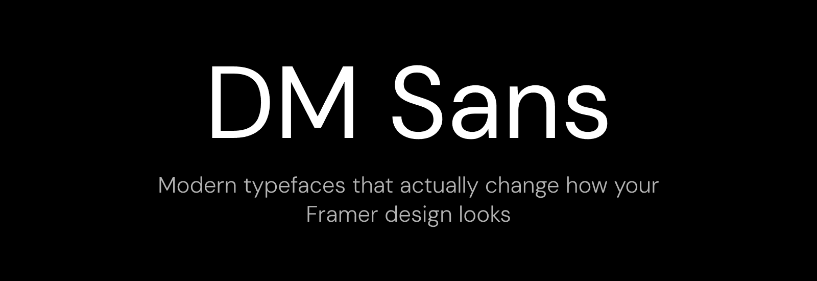
7. DM Sans
DM Sans doesn't demand attention. That's the whole point. It's geometric, legible, free, and works in nearly every context as a body font. The one that holds everything together without anyone noticing.
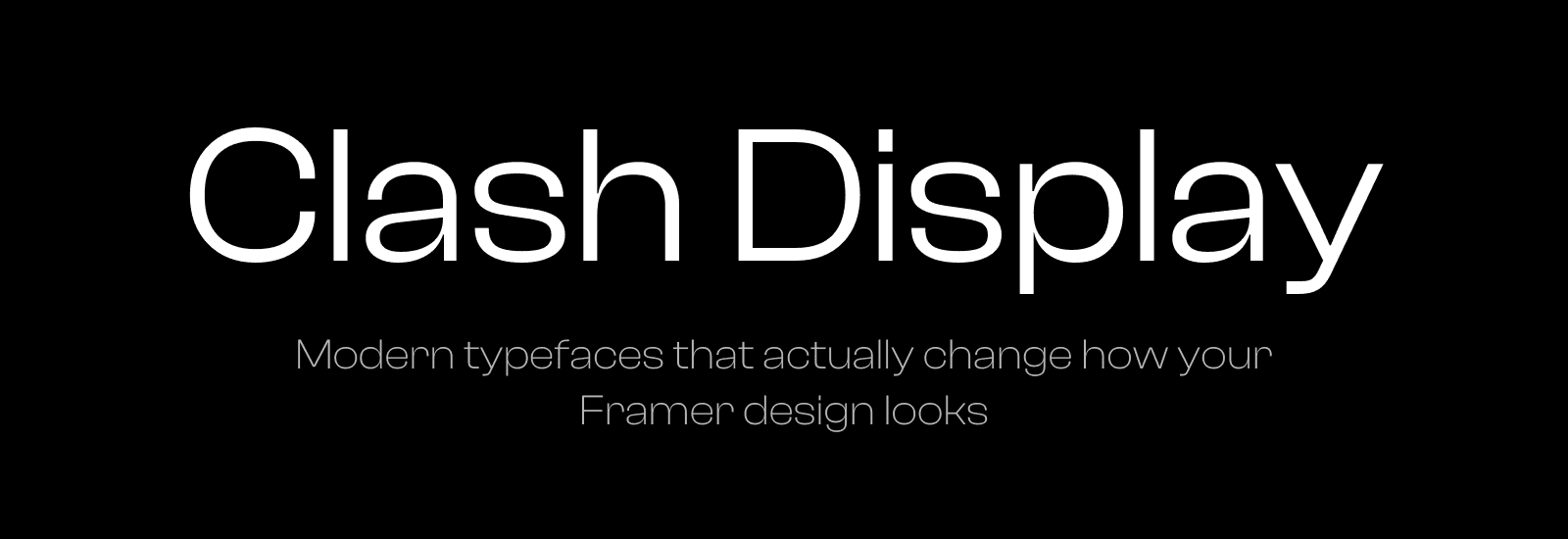
8. Clash Display
This is the opposite of quiet. Clash Display is bold, geometric, and slightly playful. A display font that actually feels like it was designed to be big. Hero sections, feature headings, anything that needs presence. It's not subtle, and that's exactly why it works.
What actually matters
Typography choices come down to what you're building. A SaaS product wants the clarity of Inter or Geist. A creative portfolio wants the personality of Switzer or Satoshi. Something that needs to feel friendly and open, that's Poppins or Outfit.
If you're starting from one of my templates, Orchid or Squish, the fonts are already considered. But if you're building from scratch, these eight are the ones I'd start with.
I'm Ava. I make Framer templates and write about design and development here. You can also find me on X.
I use AI as a writing tool — to improve my English, research topics, and develop ideas. Everything you read reflects my own perspective and experience as a designer.


