

0.05 seconds. That's all it takes for our brain to judge a design. We can't control it.
Here's the wild part: our brain isn't reading copy or checking logos. It's scanning for patterns.
And when those patterns break? Instant discomfort. That "something feels off" moment you can't quite explain.
This isn't new. Back in the 1920s, German psychologists discovered Gestalt theory - our brains don't see individual elements, they see organized patterns.
When I learned this, everything clicked. We can actually understand WHY designs work and build on a real foundation, not just gut feeling.
Every good designer knows this secret: work with how our brain is wired, not against it. When you analyze your design, don't just convince yourself it looks okay but trust your instinct on what feels off.
Here are the 5 Gestalt patterns our brain checks instantly:
1. Does this stuff belong together?
Our brain groups things based on distance. Put two elements close together, and we assume they're related. Separate them, and they feel like different concepts.
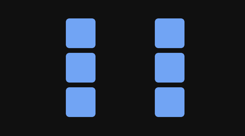
What to do: Pick 2-3 spacing values and stick to them. Maybe 16px within groups, 48px between groups. That's it. Consistency makes relationships obvious.
2. What's related to what?
Things that look alike behave alike. That's the rule our brain follows.
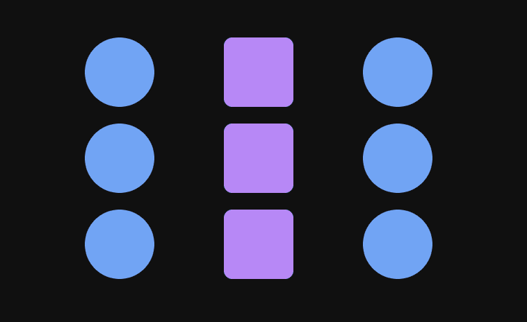
What to do: Build a component library (even a simple one). Primary buttons always look identical. Secondary buttons always look identical. Headings follow the same hierarchy. Our brain rewards consistency with trust.
3. Can I follow a path?
Our eye wants to flow. It follows lines, edges, and alignments naturally.
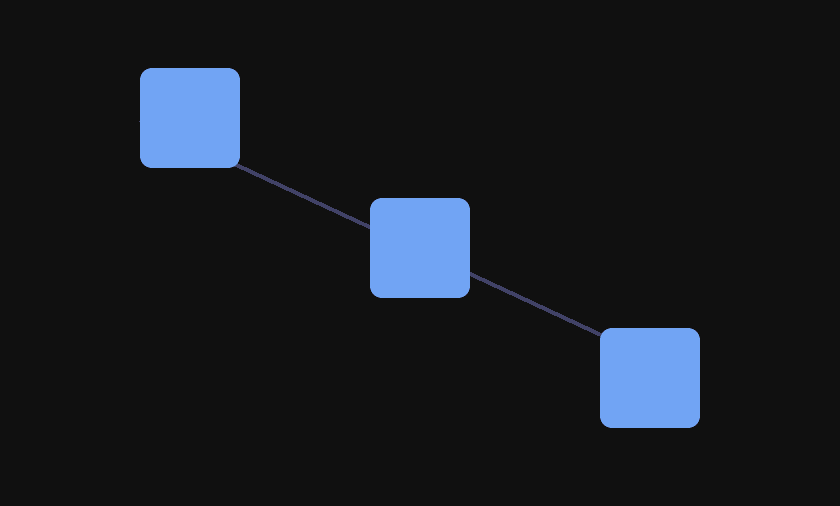
What to do: Use a grid. Even a simple 12-column grid in Framer forces alignment. When text, images, and buttons all snap to the same columns, the flow becomes effortless.
4. Can I complete the picture?
Our brain loves to finish puzzles. Show us part of something, and we'll mentally complete it.
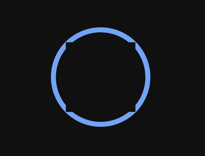
What to do: Don't over-explain with borders and dividers everywhere. Use white space to create implied boundaries. Let negative space define sections. Trust that our brain will desperately connect the dots.
5. What's the main thing here?
Our brain needs to know what to focus on. Immediately.
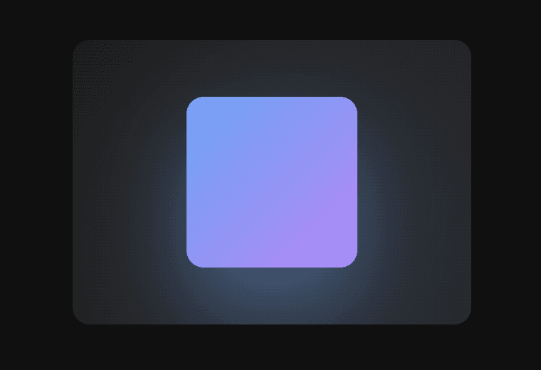
What to do: Test the squint test. Blur your eyes or step back. Can you still tell what's the most important element? If not, crank up the contrast. Make the hero bigger. Make the CTA button bolder. Make backgrounds darker or lighter, try to create creates separation.
---
Most designers never come across this. Nobody talks about it enough.
When I found out about it, it was a real eye opener. Suddenly things started to make sense.
I hope it does the same for you.
---
Lindgaard, G., Fernandes, G., Dudek, C., & Brown, J. (2006). "Attention web designers: You have 50 milliseconds to make a good first impression!" Behaviour & Information Technology, 25(2), 115–126
Free PDF version (ResearchGate):🔗
I'm Ava. I make Framer templates and write about design and development here. You can also find me on X.
I use AI as a writing tool — to improve my English, research topics, and develop ideas. Everything you read reflects my own perspective and experience as a designer.


