

Why some sites feel expensive the moment you land on them and others, just don't.
It's rarely about the fonts themselves. It's almost always about how they're used.
People feel, not read
When someone lands on your site, they don't start reading from the top left. They take in the whole page in about half a second — the weight of the text, the amount of space around it, whether the hierarchy is obvious or confusing. All of that happens before a single word registers.
Go to Awwwards and open any of the top-rated typographic sites. Don't read anything — just look. You'll immediately sense whether the page feels considered or chaotic. That impression is formed entirely by how type is arranged on the screen, not what it says.
This is why two sites can use the same font and feel completely different. One has thought through how type sits on the page. The other just picked something nice and left everything at its defaults.
Hierarchy is the whole game
If there's one thing worth spending real time on, it's this.
Clear hierarchy means your visitor always knows what to look at next. The headline is unmistakably a headline. The body text is comfortable to read. The labels and captions sit quietly in the background without competing with anything.
The mistake I see most often is everything being too close in size. A heading at 32px, a subheading at 24px, body text at 18px — it looks logical in a spec sheet but feels flat on screen. You usually need more contrast than you think.
The same applies to weight. Every weight you add should have a specific role. Display weight for headlines, regular for body, medium for labels and navigation. Three weights cover almost everything. Beyond that, you're adding noise.
Spacing does half the work
Letters need air. Words need air. Lines need air.
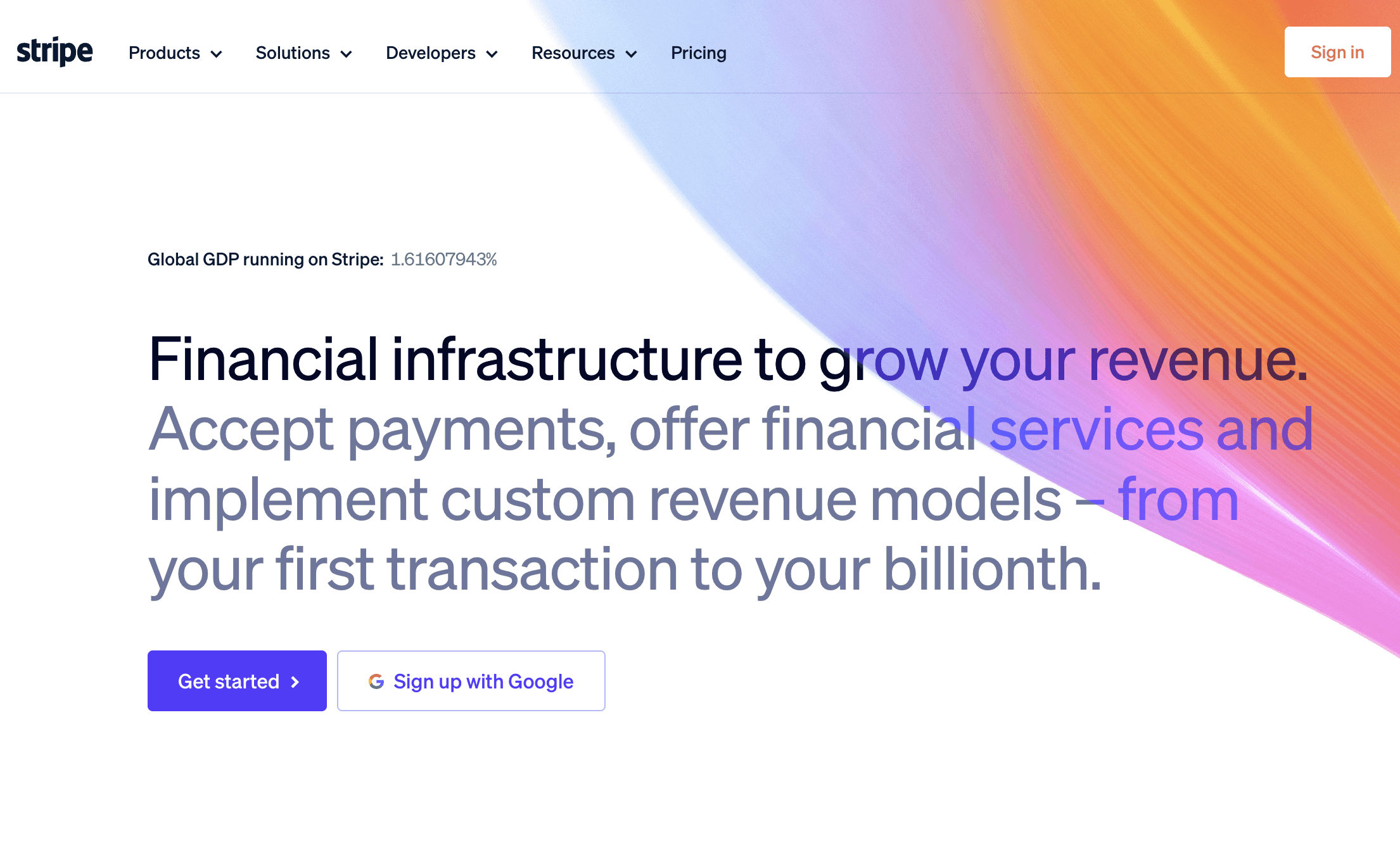
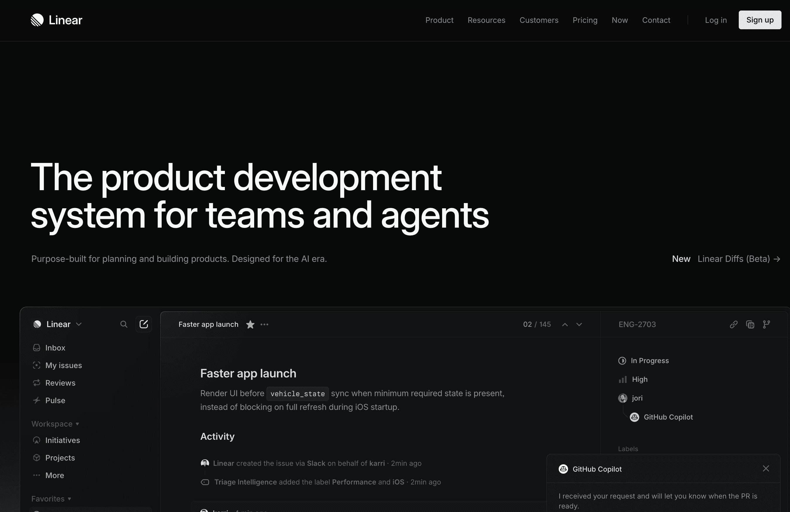
Line height is what determines whether text feels luxurious or cramped. For body copy, 1.6 to 1.75 tends to feel right. Open any well-regarded editorial site — Stripe, Linear, or browse the Framer Gallery — and you'll notice that body text almost always has more breathing room than you'd expect. It never feels squeezed.
For large display headlines, you can go tighter — around 1.0 to 1.1. At that scale the space between lines becomes part of the composition itself, not just a readability decision.
Two fonts, used with intention
Most sites don't need more than two typefaces. One for display — headlines, pull quotes, anything that carries visual weight. One for everything else — body copy, navigation, labels, buttons.
The classic combination is a serif for display and a sans-serif for body. It works because the contrast is immediate and clear without feeling forced. Look at how Notion handles this, or the editorial sections of Stripe's site — the type feels considered at every level because each font has a defined role and stays in it.
The thing to avoid is using your display font for body copy, or trying to build hierarchy using two sans-serifs that are too similar in weight and character. When the roles blur, the page loses its sense of structure.
What premium really means
It means nothing was left to chance.
A site feels expensive when it's clear that someone made a decision about every detail — including the ones that are easy to skip. Typography is where that shows most clearly, because it's everywhere. Every page, every section, every line of text.
You don't need a paid font or a complex system. What you need is to make the decisions rather than accepting the defaults. And the good news is that intentionality is free.
I'm Ava. I make Framer templates and write about design and development here. You can also find me on X.
I use AI as a writing tool — to improve my English, research topics, and develop ideas. Everything you read reflects my own perspective and experience as a designer.


