Postage Stamp
Königsberg / Preussen – West Germany 90pf
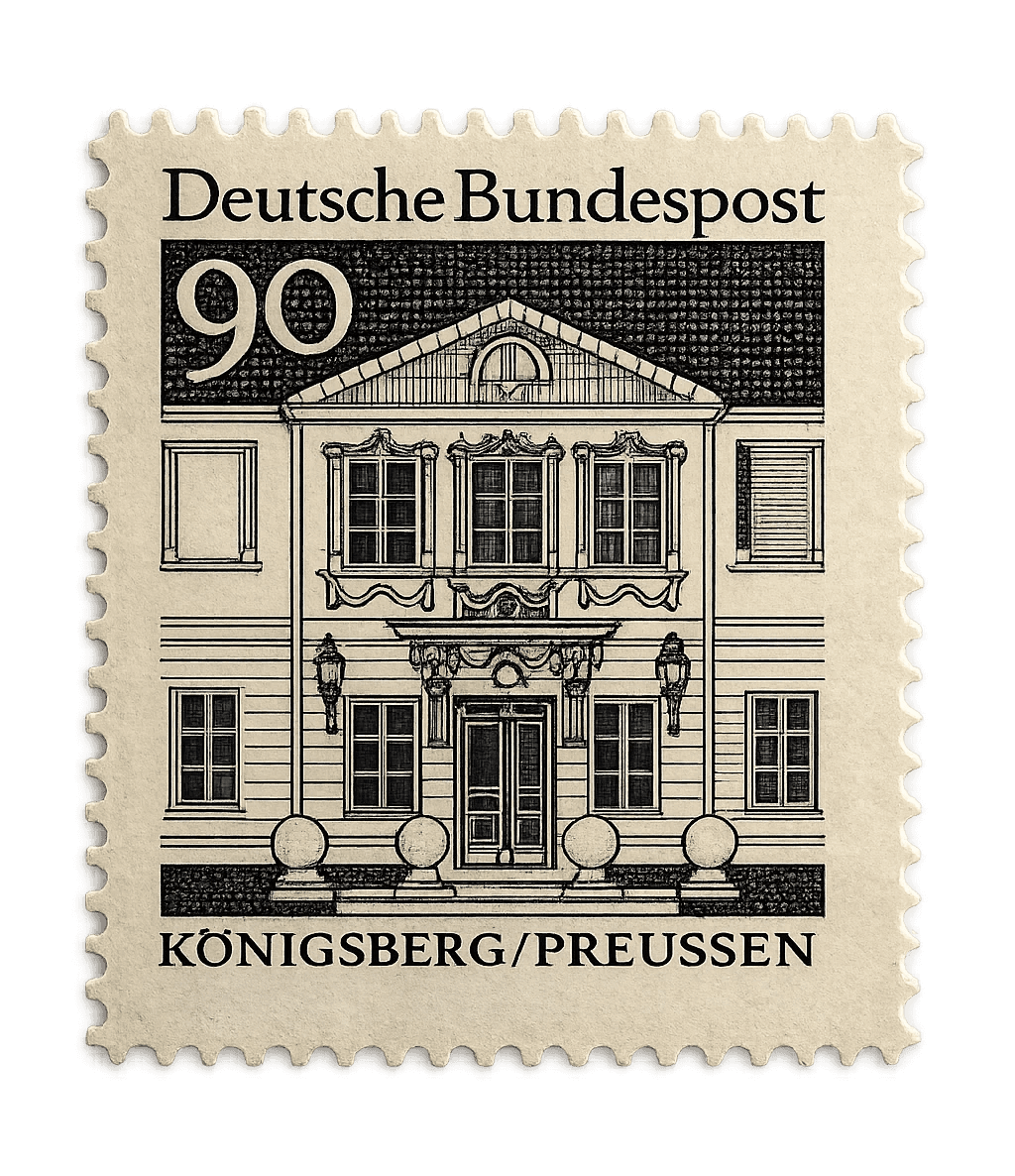
West German stamp depicting a city that no longer existed when it was printed. Black ink, engraved lines, and a quiet political act pressed into 90 Pfennig.
About
Königsberg — the city on this stamp — had already been erased by the time it was printed. Renamed Kaliningrad by the Soviet Union in 1946, its German population expelled, its architecture dismantled piece by piece. The famous castle, built by the Teutonic Knights in the 13th century and the coronation site of Prussian kings for centuries, was blown up in the 1960s. Gone.
So issuing a stamp with its facade on it was, quietly, a political act. West Germany's position for decades was that the eastern territories remained German in spirit, even if not in law. Depicting Königsberg on a postage stamp was a way of saying: this city is still part of our memory. It belongs on our letters.
Most people who ever held this stamp had no idea. They just licked it and sent a letter.
What I Find Inspiring About This
What strikes me is how graphic and minimal it is. Just black lines on white, no color, no gradients — and yet it has more presence than most things designed with every tool available. That kind of restrained, high-contrast illustration style feels completely relevant today. I could see this exact aesthetic working beautifully on a minimal website or a clean editorial layout — the sort of black and white graphic design that looks timeless precisely because it never tried to be trendy.
There's something here about trusting a single idea and committing to it completely. The whole image lives or dies on line weight alone. And it works.